New Brew: Redesigning a Tea-Commerce Site | a UX case study
Enabling loose leaf tea drinkers to buy tea online easily and confidently.

Anybody make a scratch ’n’ sniff UI yet?
….No?
Then how do you, as a designer, enable users to confidently purchase a product that they would typically smell, look over, and potentially sample in person before purchasing?
This question was one of several at the core of the redesign of experience-tea.com, the website of a small, locally-owned tea shop. I also set out to uncover the changes that could be made to improve the overall user experience, which would then hopefully result in happier customers and better business.
Client: www.experience-tea.com
Designer: Myself
Tools: Miro, Optimal Workshop, Zoom, Figma
Methodologies: User Interviews, Affinity Mapping, User Flows, Usability Testing, Card Sorting, Sitemapping, Wireframing, Prototyping
Research
My initial step was to check out the current layout of the site. You have to know what you’re working with first, right? I wanted to have a good understanding of what the site is offering and why. I learned that experience-tea.com has a two main goals:
- To sell tea
- To educate customers, both on the site and via classes
User Interviews
In order to understand how the site could better meet users’ needs, I first needed to understand the users themselves. With this in mind, I set out to learn about the potential users of the site: people who regularly drink and purchase loose leaf teas. In particular, I wanted to understand:
- Navigation: How users try to find the tea they’re looking for.
- Information: What users need to know when considering a tea.
- Purchase: What compels users to buy a certain tea.
- Roadblocks: Any issues that users encounter while shopping for tea online.
I was able to interview 6 tea drinkers who were happy to talk about their experiences buying tea online and in-store. I asked them questions like:
- What information do you look for when deciding what tea to purchase?
- Think back to the last time you purchased a new tea. How did you decide what new teas to try?
- Have you ever purchased tea online? Why or why not?
- Think back to the last time you bought loose leaf tea. How did you decide what tea to get?
Results

“I look for the flavors, the type of tea, the cut of the tea.”
It wasn’t hard to identify trends among the tea drinkers:
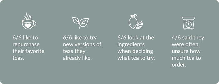
- Reorder: Users like to repurchase favorite teas, especially when buying online.
- Product Information: They like to choose new teas based on the ingredients and description of the flavors or the mood they’re trying to evoke.
- Similarity: They like to try new versions of their favorite teas, whether a different brand or a new flavor.
- Uncertainty: They’re often uncertain about ordering tea online, particularly the amount to order or which new tea to try.
This research helped me understand the users and what they need when trying to buy tea online, and this led to the problem statement:

Usability Testing
Having pinpointed what users need, I then had to understand where the current site meets those needs and where it falls short. In order to find out, I conducted usability testing so I could observe how people use the site. I was looking in particular to see how intuitive the site is for users:
- Can they easily find what they’re looking for?
- What is the process like to add teas to their shopping cart?
- What is the experience like trying to simply browse the site?
To get to the heart of those questions, I assigned users two tasks:
- To find a particular tea and add it to their cart.
- To simply browse the different teas on the site.
Results

“I guess I don’t know what black teas are…I’ll see if I can find it someplace else.”
Each tester struggled with the first task so much that they had to start over completely. The issues that they encountered were:
- Search results that weren’t representative of the site’s contents.
- Categories in the navigation bar that didn’t match their expectations.
The first task indicated a major problem with a critical function of the site: locating a tea in the first place. It was clear to me that this issue would need to be looked into further and addressed in the redesign.
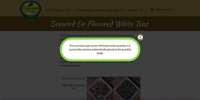
The second task was much easier for the users to complete, especially since they had familiarized themselves with the site during the first task. There were still some issues that came up- mainly, a frequent pop-up about minimum order amount that users called annoying and intrusive.

Card Sort
Since users had such a hard time locating a particular tea on the site, I realized that an open card sort was necessary. I needed to learn how users would expect the teas to be organized on the site to make it easier for them to find what they want. I was curious to find out two things in particular:
- How users would sort flavored and unflavored teas of the same type (such as mango green tea and sencha green tea). This was a source of confusion during the usability testing because users didn’t know which category to choose to look for a certain tea.
- How users would expect to find the decaf black tea, which was in its own category on the original site. Caffeination was cited as an important factor in choosing tea, so I needed to know how users would expect to find that information.
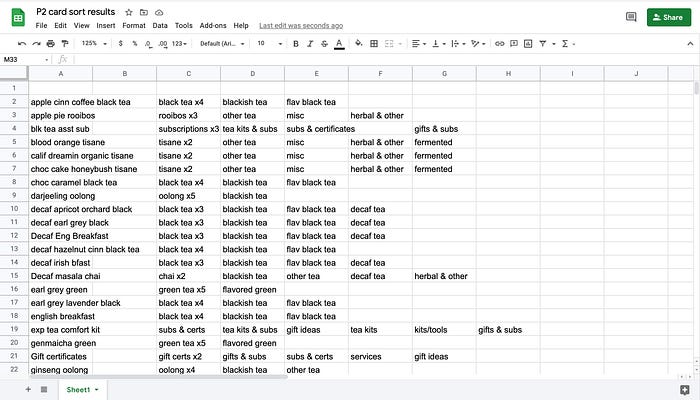
I used Optimal Workshop to create an open card sort that included a sample of the different teas, tea subscriptions, other items for sale on the site, and the classes offered by the store.
Results

The card sort showed that users would group the flavored & unflavored teas together into a broader category of tea type. For example, all green teas would be sorted together under ‘green tea’. Users also included the decaf black teas in the broader black tea category. With this and the rest of my research in mind, I started to consider the design.
Design
So, my research, as for any good UX project, turned out to be the guiding light illuminating the path forward. I knew that I needed to:
- Make it easier for users to find what they’re looking for, whether via search or using the navigation bar.
- Get rid of that pop-up.
- Give users a better idea of how much tea they would need to order.
- Arm users with the information they need to make purchases they are happy and comfortable with.
- Update the visual design of the site to elicit a certain mood, which many users cited as an important part of their experience drinking tea.
With these considerations in mind, I set to redesigning the site.


Homepage
On the homepage, I relocated some of the categories in the top navigation to the footer while keeping the links to the main goals of the site -commerce and education- at the top. Users are greeted by a hero image with a call to action button to ‘shop all teas’ as another emphasis for users to check out what the site has for sale. Further down the page, users can also see CTAs that link to the tea subscriptions and the classes.


Search Results
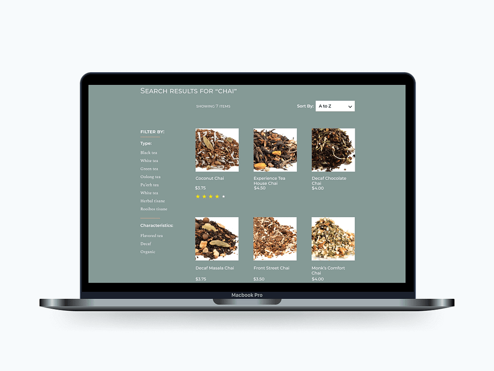
I decided to include a search function on the redesign because user testing showed that the majority of users who were looking for a specific product immediately went to the search bar. The results page was updated to show product pictures and prices so users would have a better idea of the different products. I also added filter and sort features to make it even easier for users to find what they need.

Product Page
I revamped the product detail page to give users more information before purchasing. I added information about the number of cups that a user could expect to make with a given amount of tea. I also moved the message about the minimum order amount from the pop-up to the product description. This way the information was still prominent and timely, but not nearly as intrusive. I also added stars and customer reviews because users said that information helps them decide what tea to try.
Next Steps
I have more ideas for how to make this site even more user-friendly. Users could benefit from:
- A quick-view option on the category page so users can easily read about and compare different teas to help them find the best match(a).
- Profiles so they could save their favorite teas, keep a wishlist, and easily re-order their favorites.
- Photos of the tea after it has been prepared; several users said that would help them better understand how strongly to brew the tea.
Thank you for taking the time to read my thoughts on this process, and feel free to share some feedback!
Image Credits
Icon images provided by The Noun Project: Coffee cup by Bestdesignmarket | Tea Leaves by BomSymbols | Tea pot by Krystal Majid | Lemon slice by Denicon | Heart by Shwepes | Kitchen scale by Econceptive | Computer by Linda Wati | Eyes by Sean Maldjian
Vector Mockups of the Macbook Pro and Air created by Ernest Ojeh for Figma Community.
Tea images within mockup from theteaspot.com.
